Case Studies
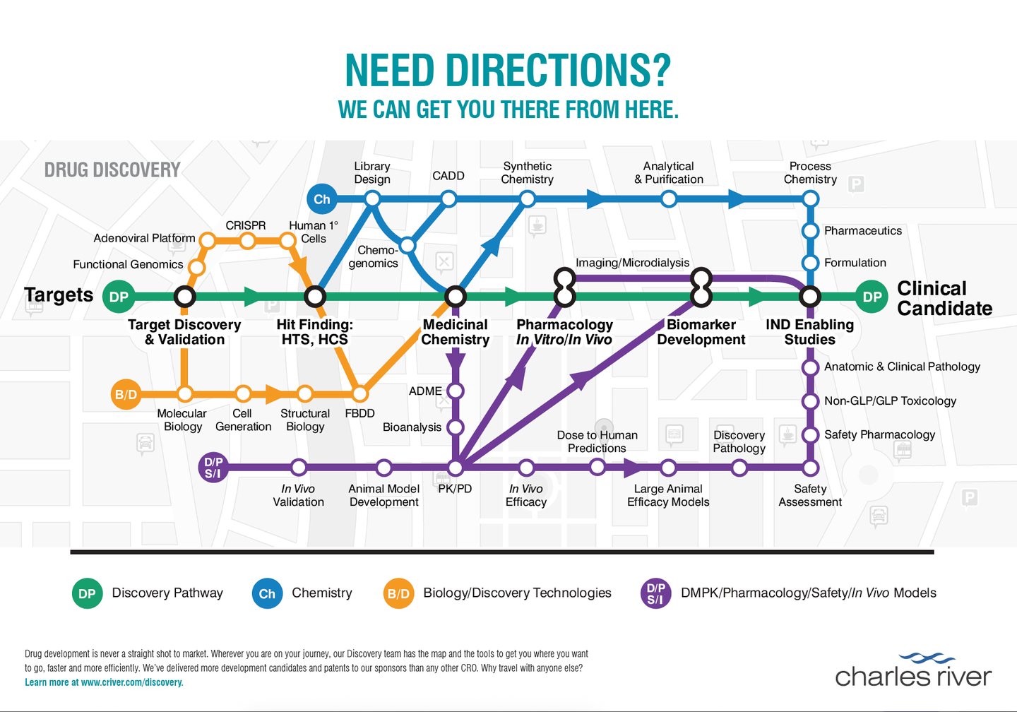
Drug Discovery Subway Map
A simple process map for the drug discovery process is fairly easy to create. Drug discovery looks like a linear process from 10,000 feet, but is far from a simple step-by-step process once you start to add the detail that our scientific audience would expect to see. I was challenged to create a visual guide to the drug discovery process that we could map to the services we offered to these customers.
I wasn't provided very much scientific or content support for this project. I think because the expectation was that this was too steep a challenge. There were two common ways the process was illustrated in the past: the chevrons and the funnel. Neither of these illustrated the required complexity. In my research, I found an in-depth scientific paper outlining the drug development process from start to finish. Although very thorough, it still wasn't detailed enough in the drug discovery part of the process to meet the challenge of mapping our specific services. However, I knew I had found the inspiration I needed.

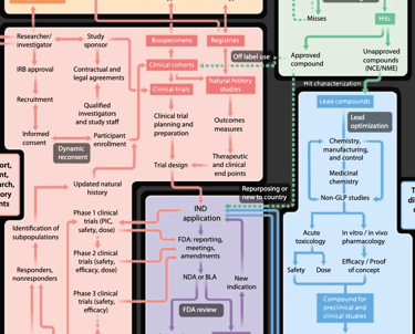
The map I found in the whitepaper had different color-coded tracks that flowed into and intersected other tracks, and was a non-linear path with loops that helped you ultimately reach a destination. I was amazed that the comparison to the famous "Vignelli" New York City subway map had not been identified as the solution before.
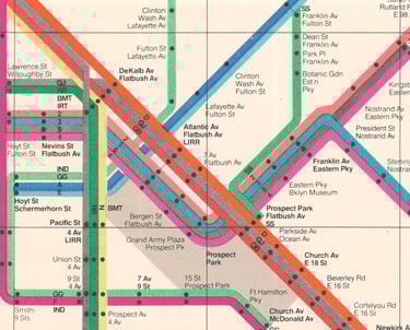
Once I made that connection the illustration practically created itself. The concept was simple enough that the subject-matter experts were able to quickly fill in the correct information and plug the content holes in my rough design. Since the subway map reference was so strong and so quickly understood, I decided to illustrate this as an actual subway map (although I relocated the map to Boston for the biotech audience), referencing the classic design that the audience is broadly familiar with. We added "tracks" and "stops" that corresponded directly with our related services, and the map was a huge success, meeting the design challenge and the needs of the customer and the company.
Creating an Efficient Content Creation Process
Effectively producing and distributing compelling marketing materials is a challenge that every marketing department faces. This can be a long process that involves multiple teams, and multiple potential roadblocks. It's important to have someone with a vision for success that can develop tools and guide a project through the process.
Most companies develop some sort of template structure for different collateral types, but this approach often falls short, or doesn't address some of the most pressing challenges marketing departments face. Templates can be defined many different ways, and often only affect the end of the process. I been involved in many different efforts to streamline the content creation process. With the experience I've gained, I've developed effective tools and processes that are integrated from start to finish.


What I've built is a series of content and design templates that produces a baseline campaign with a flagship brochure, social media and digital ads, and support literature that is meant to guide users through their buying journey step-by-step, rather than just dumping all the information at once. Not only is this process more efficient than a single-tactic campaign, but it also allows for data collection to understand where a potential customer is in their journey so we can provide tools to bring them to a purchase.
The process starts by mapping out that particular customer journey, identifying milestones, and determining what we want to provide to customers at those points to move them towards a sale. A simplified example would be the customer is drawn into the process with either a social post of contact with an account rep. Then they are given a short, high-level brochure created to give a brief overview and lead them to a web page for the next step in the journey. Tracking urls for specific sections in the brochure let us know the services they are interested in. The brochure is also set up so that each spread is a complete concept for social media or other advertising. Each spread contains a headline, subhead, support copy, an image, and a CTA. You can easily farm that into a social post with only design changes. No need to re-engage with copy for additional work. We also keep the detail limited because we know we can provide that detail on the web page or in more detailed technical sheets that we develop using templates in tandem with the brochure.
Every campaign has different goals, and we build flexibility into this process to help meet those goals. But we always have this baseline of collateral that we can deliver on a reliable timeline. Everything always flows from the brochure, which has a consistent copy structure. We don't need to reinvent the wheel every time, and developing content is almost as simple as filling the blanks on a form. This is not meant to remove creativity from the process. We strive to simplify the basics so that we have bandwidth to give additional effort to the areas where that effort will pay off, such as a custom illustration or animation. By sticking to this process we reduced turnaround time for these campaigns from several months down to four weeks.
You can find examples of these brochures here.

Data-Driven Creative Decision-Making
The ability to make data-driven decisions in creative work is essential to creative teams and the companies they support. However, developing good metrics for creative work is a complex challenge. We often need to blend objective data with subjective analysis that prioritizes our customer's preferences over our own. AI has given us new tools to generate and analyze data, but it's only the beginning of the process.

The biggest opportunity for improvement was in our animated posts. They were not performing as well as I wanted them to. I dug into the data, looking for animated posts that performed well and compared those to posts that needed improvement. We identified timeline and content structure similarities in our successful posts, integrated those changes upstream in our content development process, and did A/B testing on the changes, also comparing them to static versions for the same content. These changes brought a dramatic improvement to our post engagement, increasing clickthrough rate for animated posts by over 500%.
We identified a good dataset in our social media metrics. I asked our social media manager to compile a spreadsheet breaking down our posts into content types and showing engagement stats. I then built it out further to include screenshots so we had a visual overview of headlines, layouts, and design decisions. Gemini and Perplexity offered limited analysis of ways we could improve our design work for better engagement, but I was able to use these AI tools to identify opportunities for further exploration.

Celsis Rapid Microbial Detection
Celsis produced instrumentation to simplify the process of rapid microbial detection. Among other value props, we identified that the nearest competitor's device was the size of a laboratory fridge, which the Celsis instruments were desktop devices that could easily be integrated into a customer's existing lab space.
We were already producing a brochure as the flagship literature for a campaign around the many benefits that Celsis offered to customers. We knew this would be printed and handed to clients. At the time, the latest surging technology was augmented reality, where you could interact with digital objects in real space using your phone's camera (Pokemon Go was hot at the time). I knew we had an opportunity to try something new that would make an impression on our customers.
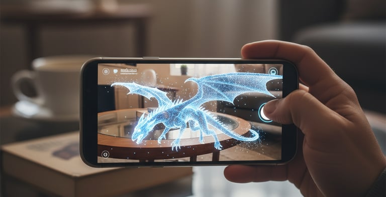


I reached out to the product designer to get a CAD file for the instrument and brought that into Blender to skin the rough foundation that the CAD file provided. Once I was happy that the model had sufficient detail, I needed to teach myself the tools to build an AR experience. We added a QR code and some simple tracking elements to the back page of the brochure. We also provided some specific training to the account reps to highlight this new capability. When the customer brought this brochure into their lab, they were able to lay it face-down on their benchtop and see exactly how this instrument could easily fit into their current space.
Although the virtual materials for this piece are no longer live, you can download the revised brochure design here.
Explore Charles River
How do you demonstrate the portfolio of a $3B company that provides both products and services to a broad range of industries across the entire spectrum of drug development and manufacturing? This was the question that interested me for years as I worked on a broad range of projects for our different businesses and customers. I knew there was demand for a tool like this, even though nobody ever came to me to request it. I took it on myself to develop it.
Obviously, the best way to understand our entire portfolio was our website. It contained all the information I needed, including a hierarchy and structure that the company had already spent considerable time developing. So I started with a simple site index, and build a JavaScript database that included every page on our website with additional data I could use to add details at-a-glance.

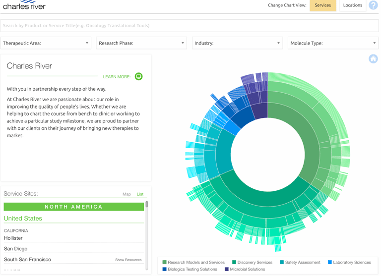
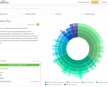
At the time, I was working on my web development skills, particularly focused on compelling ways to visualize the data that is so important to a scientific audience. I was introduced to the D3 JavaScript library created by Mike Bostock to build data visualizations for the New York Times by a friend who was using it for National Geographic. I taught myself how to work with the D3 library and added additional fields to my database to organize the site index into a circular chart with hierarchies that would bring up additional details when the user clicked on a node in the chart. D3 is essentially a library for processing data, so I needed to do considerable design work to make the visualization look great and be easy to navigate. At this point, I had created the tool I wanted to see and I brought it to the leadership of the marketing team.
Leadership loved the tool, but had some additional challenges that would help the account reps share our capabilities with our customers. How would this information map to our facilities around the globe? I knew the D3 library had mapping capabilities, so I got to work on solutions. The content for site capability already existed, so I was able to add information to the database that identified the sites that could handle each service node. I could then sort that information to create a new circular chart relevant to each site. Then I added those sites to the mapping feature in D3, which would show sites relevant to each node as an additional detail when the user clicked. Then I created a map-based version that would allow the users to explore our services based on location. We then launched the tool to empower our account reps and customer to understand our vast portfolio at-a-glance, and explore the capabilities of each site in a simple, visual tool that provided links to videos, collateral, and site links to learn more.

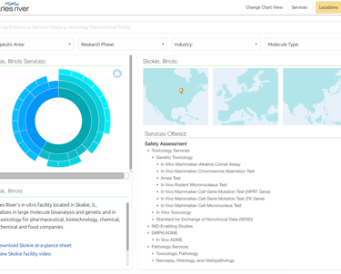
This tool is still live on the Charles River website at explore.criver.com
Bringing Unique Art to the Scientific Space
I come from a background in studio art. I decided to build a career around design, thinking that these two fields had a lot in common. I think the comparison is natural for many people getting started in design. While there is some overlap, there are fundamental differences that makes them wildly different.
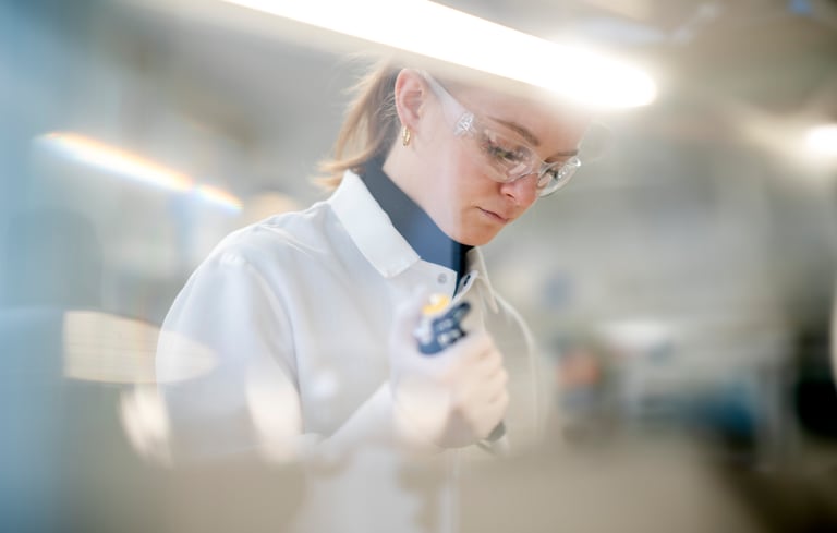
I've always been driven to bring a unique artistic touch to my designs when appropriate. Not only does the final product look better, but it helps meet a common design challenge to have people stop and look at something long enough to get a message across. I find this particularly important in the scientific space. Nearly everything we see is stark, fluorescent lab photos of people pointing at computer screens, illustrations that come straight from BioRender, or the common 3D-rendered images that fill the pages of royalty-free stock sites. While these are tools I certainly keep in my toolbox, I am always looking for opportunities to do more.

One opportunity I've focused on developing is photography. I strive to avoid images that I could easily buy from a stock site. I like to see creative lighting and angles, a shutter drag to create movement, and objects interrupting the frame that help keep the focus on the main subject. I also have experience getting images that have good design longevity. It's important to keep plenty of crop and copy space, and not be too subject-specific, so that an image can be used for multiple topics. There are also additional considerations for scientific photography, such as being sure subjects are wearing proper PPE, glass and instruments are smudge-free, and that there's nothing in the frame that would make the lab GLP non-compliant. I want images to look great and not feel like models cosplaying as scientists. Authenticity and accuracy is important to a scientific audience.
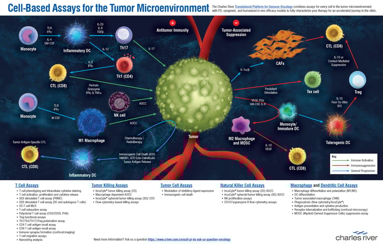
The other big opportunity is illustration. The biggest challenge with scientific illustration is accuracy. If something is scientifically questionable, you lose your entire audience and credibility. This is probably why most marketing groups just take the graphics the scientist provides and leave them as-is. In some cases, this is a missed opportunity. When we were looking to promote services around the tumor microenvironment (TME), I knew we had a chance to do something different. Working with the subject-matter experts, I created custom illustrations for each part of the TME. In the end, I also created an animated, interactive version of this that we used on a large touch-screen at the SFN trade show.
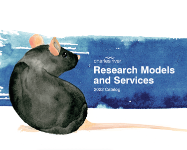
There is also the chance to replace traditional photography with illustration. The Research Models catalog was the largest project for one of our businesses. I did this project myself every year because of the complexity and attention to detail it required. One year, I proposed something special. We always treat this subject with reverence, because of the nature of how these animals were used in research. I thought it would be a special tribute to create custom watercolor paintings to make the catalog feel more unique. This was a departure from how these images appear across the industry, and we used these images throughout the year as a theme for the business.
You can download the full catalog here and see all the images.